
How Many People Can't Find a Home?
A simple technique will show you how much demand remains unsatisfied

We all love MLS.
Well, we all love the data in MLS (ok, I love the data in MLS.)
I’ll admit that our MLS could have a better user interface, the way it communicates with clients leaves a lot to be desired, and its safe to say that the ability to customize isn’t great –– but from a data integrity standpoint, it is (dare I say) our most powerful and important tool.
Why? Because it captures most every residential real estate transaction in a market, and it does so in a very detailed (and vetted) manner.
What is in MLS?
In any single MLS record in the database, you get the physical characteristics of the subject home, any updates and / or improvements are noted, a visual is typically captured by HD photography / video / drone footage, and the details of the transaction are captured as well –– from price to terms to concessions to dates.
Often, MLS records also offer a repository of other critical documents such as surveys, deed restrictions, and floor plans, and are synced with tax records / assessments and flood maps, as well as a history of any prior sales –– all within a few clicks.
MLS is a literal treasure trove of housing information.
Is it Accurate? You Bet!
And something that the public does not always realize –– incorrect or misleading information leads to fines and other liabilities, and repeated offenders can lose their access to the system (which effectively ends a career.)
So the data integrity is quite high.
Zillow and other online portals do not have the same checks or penalties in place –– so search at your own risk.
MLS as a Whole
On a typical day for an agent, MLS is where we find out what is for sale as well as what sold recently. MLS is where we do our research on values of individual properties and can communicate our findings with our clients.
Most agents use it all day most days, and really don’t need a lot of other tools in order to conduct their business.
Aggregate for Trends
But once you get past looking at individual homes, the system gets even more powerful.
When you aggregate these thousands of records together, you can learn so much more about the market, the trends, the direction, and of course, what the future seems likely to happen.
And at no time in the past has this skill been more important than it is today.
It’s About Demand
In a prior blog, we discussed in great detail the connection between inventory and price movements (see below):
The Most Important Chart in Real Estate

If you want to better understand the connection between inventory and price movements, this post is for you.
Simply put, when inventory is low, prices tend to rise –– and the lower the inventory, the faster the price movements.
Inventory (in the economic sense) is the ratio of supply over demand. If you have 100 homes absorbed in the past 30 days, and 300 homes available, then you have 3 months of inventory (300/100 = 3).
Knowing the months of inventory allows reasonable guesses at home price appreciation.
Quantifying Unsatisfied (or Excess) Demand
But what the inventory metric doesn’t quantify is how much demand is ‘unsatisfied.’
Stated differently, ‘How many more homes would have sold had they been available’ is not a statistic that exists.
Why? Because only one person can purchase a home, and even 10 people made offers, the number of offers is not recorded anywhere.
Or is it? And can we calculate it?
Let’s discuss.
The Macro Issue
I am aware of multiple studies that have attempted to quantify the undersupply of housing in the US.
Realtor.com has done a study, and has Freddie Mac, as well as Zillow –– and all of these studies indicate that the number of housing units in the US versus the demand for them is about as far out of whack as it has ever been (and not getting better.)
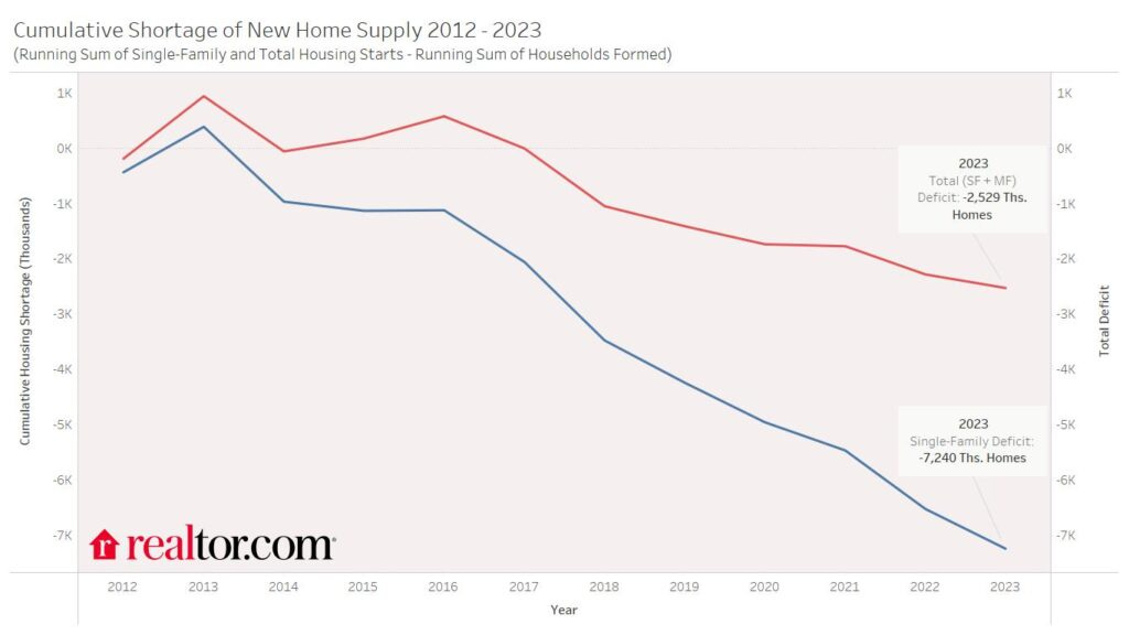
Realtor.com estimates that the US is roughly 2.5M single family housing units undersupplied:
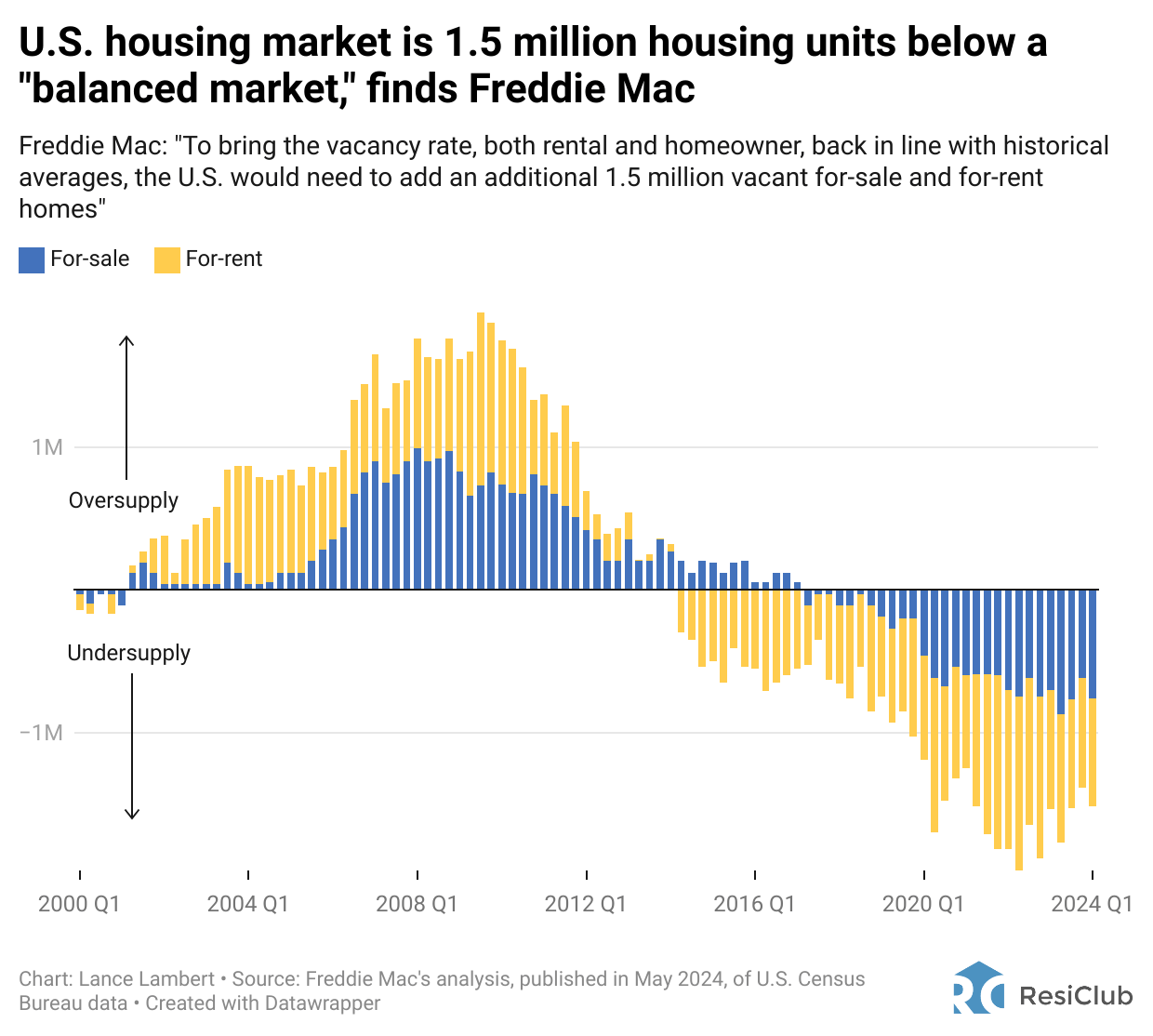
Freddie Mac estimates the deficit at 1.5M units:
Zillow’s study is the most extreme, placing the deficit at 4.5M:
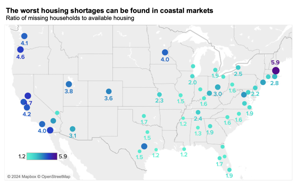
Regardless of the method that seems to make the most sense to you, no study shows that the US has too much housing, especially at the more affordable end of the market and / or close to employment hubs.
The bottom line is that the market is still undersupplied in the aggregate.
The Buying Process
Ok, before we can estimate how much any individual segment is undersupplied, we have to look at the buying process and what it tells us about the demand / supply gap.
For anyone who has been in the market recently, or for any agent who has worked with a buyer in a highly competitive segment, you know the drill, and it sucks. Escalation clauses, waiver of inspection and appraisal, rent backs –– all are common tools used to secure a win.
So it works about like this –– you see the perfect home come out on MLS and you set up a showing as soon as you can. You walk through it (it checks all the boxes) and you decide to make an offer.
What happens next?
You write up the super strong offer, sign it, and you agent submits it to the listing agent alongside the other buyers who decided to write as well –– and hope that somehow you are the one chosen.
Counting the Losers
For this example, you are the winner (yay!) and so you get to go stop looking.
But assuming that another 10 people decided to also make an offer, what happens to the ones whose bid is not accepted? Most of the time, they go back to square one and start the process over.
So in effect, if there were 10 offers, it means that 9 buyers still exist and will reemerge the next time another similar home comes on the market. Perhaps one might leave the buyer pool after multiple misses (call it ‘Buyer Fatigue’), but generally speaking, the need to purchase a home does not go away even though the bid isn’t accepted and so most stay in the hunt.
The Buyer Pool Formula
If you had to write a formula, it would look something like this:
Buyer Pool = Total Number of Offers - One Winner - Buyer Fatigue
So if you can fill in these blanks, you can estimate how many buyers might be in any given segment at any given time –– and plan accordingly.
Estimating the Buyer Pool for Your Market Segment
So how can you estimate the number of excess buyers floating around?
It requires a little bit of work, but it can be done by looking at the percentage of the asking price that a seller received on their home, and making a few assumptions.
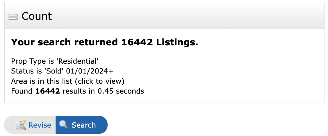
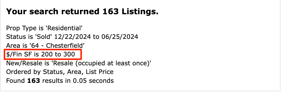
Below is a summation of the last 6 months of sales of resale single family homes in Northern Chesterfield County between $300K and $500K:
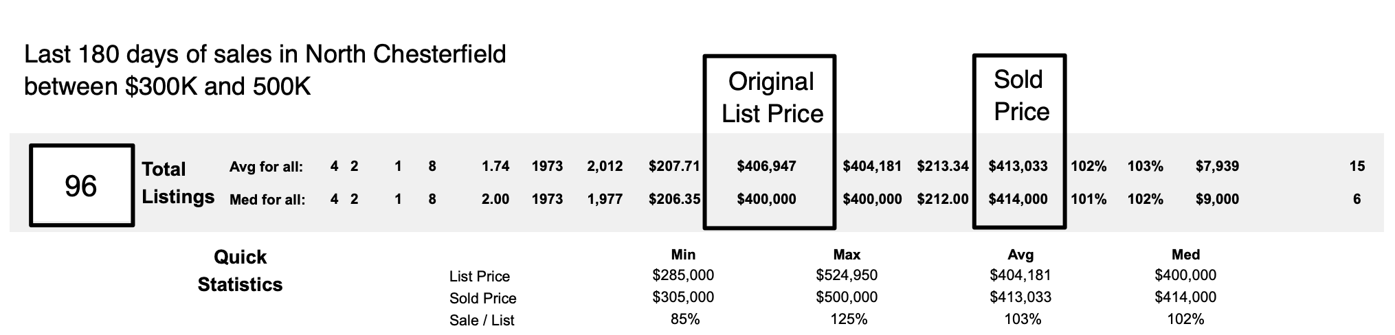
Per the quick CMA feature in our MLS, these homes sold for an average of 102% of asking price tells me that the number of buyers seeking housing in the N. Chesterfield area is greater than the supply.
Helpful, but incomplete.
But By How Much?
What the summary doesn’t tell me is how many more buyers there are. To know that, you have to do a little more math.
How? by weighting each sale.
Here are some basic assumptions you can use to estimate the size of the buyer pool:
If a home sold for less than asking price, there was likely barely one buyer trying to buy the home –– let’s call that less than one buyer (.8 feels about right)
If the home sold at asking price, there was at least one buyer –– let’s just call that 1 buyer
If the home sold for more than asking price, then the price was likely bid up by multiple buyers –– let’s assume that any over asking price sale involved 3 buyers
You can then go back and look at recent sales and so some basic arithmetic.
Download / Sort / Compile
By downloading the sales and sorting them by the asking price / close price ration, I determined the following:
24 sellers took less than asking price
14 sellers got full price (no discount)
58 sellers got MORE than asking price
Using the weights from above above you get:
24 sales below asking price x .8 = 19.2 buyers
14 sales at asking price = 14 buyers
58 sales above asking price x 3 = 174 buyers
This implies that there were 207 total offers made on 96 homes –– which means that there are still 111 excess / unsatisfied buyers in the N Chesterfield market segment between $300K and 500K less those who tire of the process and drop out.
In other words, still a very competitive and undersupplied segment –– and with an extra +/- 100 buyers, it will be that way for some time.
Make sense?
Criticism / Improvement / Takeaways
Above was one example, but you can use this technique for any segment, asset class, or geography –– and you can also go back in time to see how much the demand characteristics of a segment have changed.
It is a great tool.
Criticism
So you are telling me that there are exactly 111 extra buyers for my house in Settler’s Landing or Woodmont?
No, of course not.
This is not an attempt to be exact in the quantification of the buyer pool –– this concept is flawed in that it assumes that all homes in a segment are essentially the same (they aren’t) and all of the people in a buyer pool are homogenous (and they aren’t, either.)
You know the old adage about ‘assume.’
So much subjectivity goes into any decision to offer on a home that stating any number with 100% confidence is rather foolish –– we recognize that.
Use it as a relative measurement, not an absolute one.
Improvement(s)
Furthermore, the idea of weighting is also quite subjective.
The use of 3 offers for any home sold above asking price in this model is good enough for illustration, but you can get a lot more refined if you choose to.
For our own internal model, we get far more specific in how much we weight the number of buyers based on the % over the asking price. Our past sales history indicated a very strong correlation between the number of buyers for a home and the percentage over asking price the home sold for (spoiler alert, it isn’t always 3.)
So the bottom line is this is a grossly simplified model, the one we use with our clients is far more detailed.
Buyer Fatigue
The concept of ‘Buyer Fatigue’ also is quite subjective.
Do people leave the pool after they miss 3 times? 5? 10? Do they rent? Do they change price range? Do they leave the area altogether? Do they start looking across town? Do they flip from single family to town home or condo?
We know the concept is real, but the impact is up for debate.
The bottom line is that you are free to use your own weights.
Takeaway(s)
I think the real use of this technique depends on the question you are trying to answer:
If you are concerned about the recent news coming out of other markets about inventory rising, you can look at your segment and see how over / under supplied it is. What is happening in other markets is not happening here, but now you have a way of determining that and to what level.
If you are thinking of entering the market, you can see what you are up against and perhaps find a segment that is less in demand than the one you are entering. Generally speaking, if there is a lot of new construction in the segment, the excess buyer pool is will be smaller.
If you are a builder and you looking for guidance about what to build and how deep the demand is, you can easily use this to inform your decision about the price to target.
If you are a seller, you can use this to see how much in demand your home will be. Pricing it at the tip top of the segment, you can overshoot and end up missing the chance for a bidding war developing.
But that is what makes this calculation so useful –– it really applies to a lot of situations and can answer a lot of different questions. Buyers, sellers, developers, and builders can all benefit from understanding not just if a segment is under (or over) supplied, but by how much.
Use as needed.
A Final Thought – Consider Using Price per Foot
A final note –– most choose to define a segment by some geographic boundary and price, but you can also use this technique using price per foot.
When only using price, you can be fooled into thinking that all homes in a given price band are the same –– and we all know this to not be true.
By using price per foot, one can see how demand tends to decrease as price per foot increases. And you can find the point on the demand curve where demand flips from positive to negative.
Using price per foot in this calculation helps prevent you from over-pricing and the accompanying frustration that comes from not understanding why a segment with 111 extra buyers seems to be ignoring your home.
Summary
Real estate is 99% emotion, and the other 50% is math (or something like that.)
Humans are emotional creatures (especially when it comes to our homes) and the headlines that are written or the stories told on the 6:00 news are designed to scare us.
Don’t let them.
The real estate world is not about to end (at least in RVA) and our market is still undersupplied at almost all price points and all segments –– but now you can determine by how much!
Yes, I know rates are up (that doesn’t matter by the way, but more on that in another post) and that other things in politics and the economy seem scary –– don’t panic.
Use this technique to see how the segment you live in or want to buy in is doing and make an informed decision.