
The Most Important Chart in Real Estate
Examining the correlation between Inventory and Home Price Appreciation, and examining it in a very RVA way.

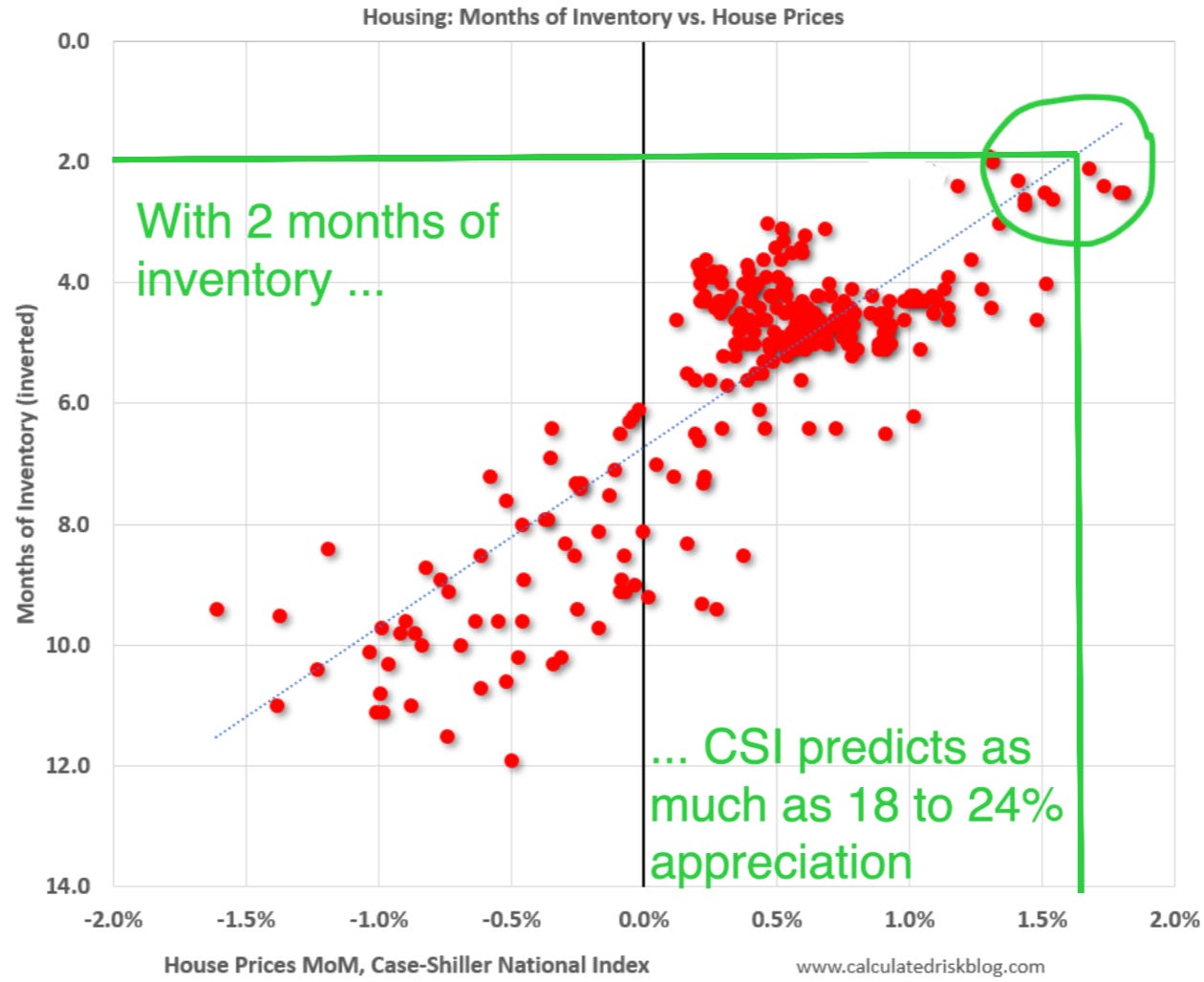
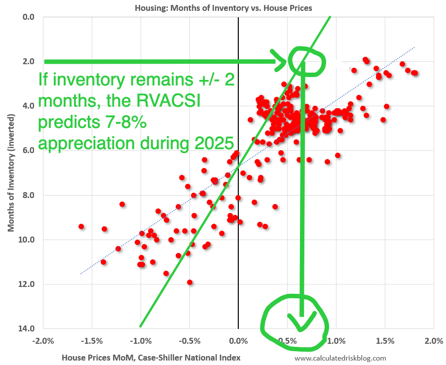
Below is the most important chart you can ever hope to understand if you want to know what is happening to the home prices in your market.
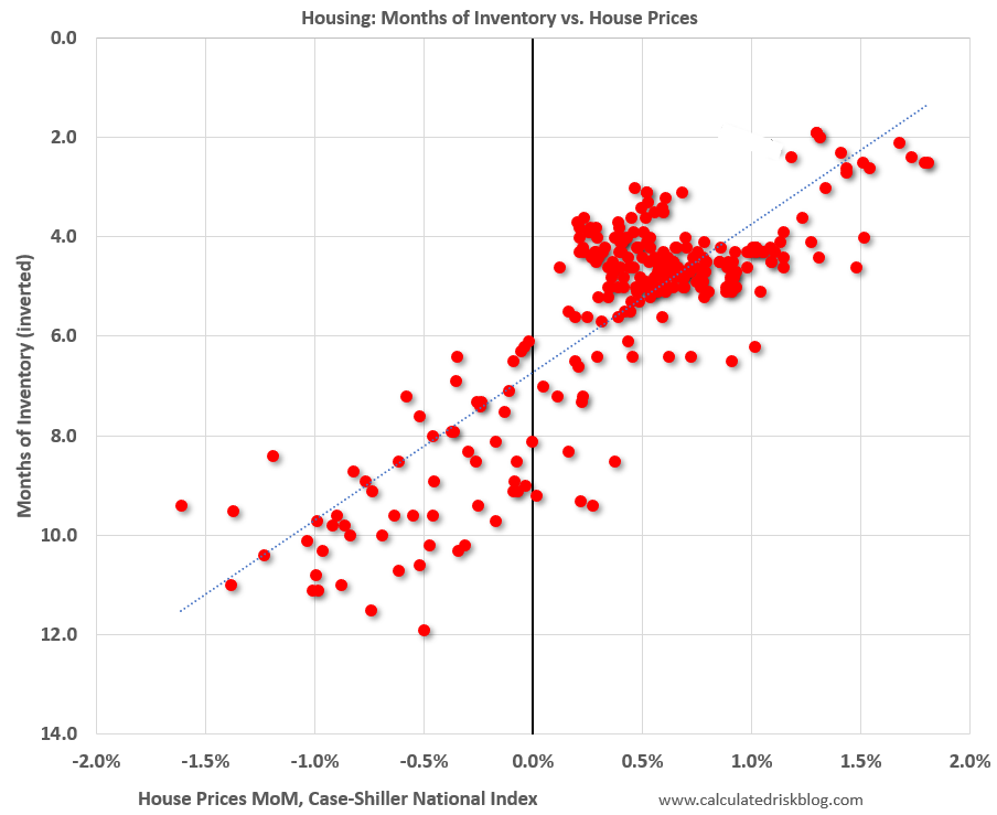
Spend a moment or two just staring at it … looks kinda simple, right? Just sort of a dot plot with a simple linear regression line showing the trend.
But what is it? And why does it matter?
Let’s dive in.
What Is the Chart, Exactly?
What you are looking at is the Case Shiller Index (CSI), the gold standard when it comes to measuring the rate at which home prices have historically moved.
(A quick shoutout to Bill McBride / Calculated Risk Blog who I believe created the x/y layout to better show the correlation. You should follow his blog. Good stuff!)
The CSI examines how much home values have increased or decreased over time, and then compares the price movements to how much inventory was available at the time when the property sold –– in effect establishing the correlation between housing inventory and pricing movements.
To summarize:
On the X axis (horizontal) is the monthly rate of appreciation
On the Y axis (vertical) is the number of inventory ‘months’
When you plot the price movements and inventory along both the x (price) and y (inventory) axises, it becomes evident that the two variables are related.
So the takeaway is that if you know a market’s inventory levels, you can predict (with a reasonable level of certainty) what prices are likely to do.
A few additional notes on the Case-Shiller Index:
The CSI has been tracking prices since 1987 when it was created by Karl Chase and Robert Shiller (who has a Nobel Prize, btw…)
It measures prices in the 20 largest metros in the US
It actually measures ‘same homes sales’ to calculate price movements, versus using the median price in an area, but makes adjustments for renovation / addition / other improvements so as to measure the sale of the same home in the same condition
You can read more on the CSI here.
How to Measure ‘Inventory’
I think before we go any further, we need to spend a moment on calculating real estate’s version of the inventory metric.
First, when the word ‘inventory’ is used in real estate, it is measuring something very specific –– inventory (stated in ‘months of inventory’) measures the amount of time it would take to sell every home on the market provided no new homes came to market.
In effect, saying that a market has 4.5 months of inventory simply means that at the current rate of sales, if no new homes were listed, in 4.5 months, the active inventory count would go to zero.
As a formula, it looks like this:
Inventory = Active Listings / Pending Contracts in the Last 30 Days
To put some actual numbers on it, if your market has 1,500 active listings and 500 homes have gone under contract in the last 30 days, then the market has 3 months of inventory:
1,500 active / 500 pending in the last 30 days = 3 months of inventory
Inventory is basically is describing how well a market is supplied and how quickly the supply is dwindling / growing.
Remember, Inventory is a Ratio
So this is critical to understand –– the inventory metric is a RATIO, not just a count of available homes.
If either input (available homes OR absorption) changes, the ratio changes as well:
If absorption slows but the number of homes remains constant, inventory will rise
If absorption remains constant but the number of available homes rises, inventory will rise
If both absorption and the number of available homes rise, then inventory won’t move very much
So a change in demand OR a change in supply will be reflected, which is extremely helpful in assessing not just the market’s condition, but whether it is strengthening or weakening (and at what rate.)
Good stuff, and relatively simple to understand.
The Power of the Inventory Metric
The inventory calculation is one of real estate’s most important and informative metrics. The public tends to focus on price, but the pros focus on inventory.
Why? Because inventory drives price movements –– so keeping an eye on inventory will tell you what pricing is likely to do.
Remember, inventory takes into account both supply AND demand, and it does so pretty much in real time. By looking at what is happening to the number of buyers and sellers in the last 30 days, you can gain a lot of insight as to what is happening in right now and not having to wait for the typical housing reports that lag by 30 to 90 days (or more.)
Get Specific
Furthermore, you can calculate inventory of very specific markets quite easily, meaning that you can look at the conditions of markets as specific as individual neighborhoods (say, Wyndham or Westham) or types of home (4 bedroom homes in Chesterfield or condos in the Near West End) to gain insight on how a market segment is performing relative to the market as a whole.
No other metric in real estate is as informative (and predictive) as ‘months of inventory’ is.
Inventory by Segment
As referenced above, you can get hyper-specific in how you measure a segment and gain a sense of whether or not the segment you are concerned with is performing at / above / below the market in the aggregate.
Any Metro region tends to be made of up of a composite of sub-markets with (potentially) differing inventory measurements.
Typically:
Higher price points tend to have more inventory than lower price points, mostly because the cost of construction makes building affordable new homes at scale nearly impossible
Urban / mature markets tend to have lower inventory than suburban markets, mostly due to the fact that new construction is easier in suburban markets
Townhomes tend to have higher inventory levels than single family detached housing due to the rate / ease at which each can be built
So simply looking at a region and assuming that all of the sub-markets within the region are behaving similarly is likely incorrect.
Inventory will vary by asset type (townhome, condo, detached) and by price (affordable, luxury) and geography (Church Hill, Short Pump, Ashland, Midlothian) so make sure you are defining the universe of homes properly to use inventory as a valuable guide.
Dissecting the Case-Shiller Index
So back to the original chart –– let’s look at how the market behaves at different inventory levels.
Where Prices Rise or Fall
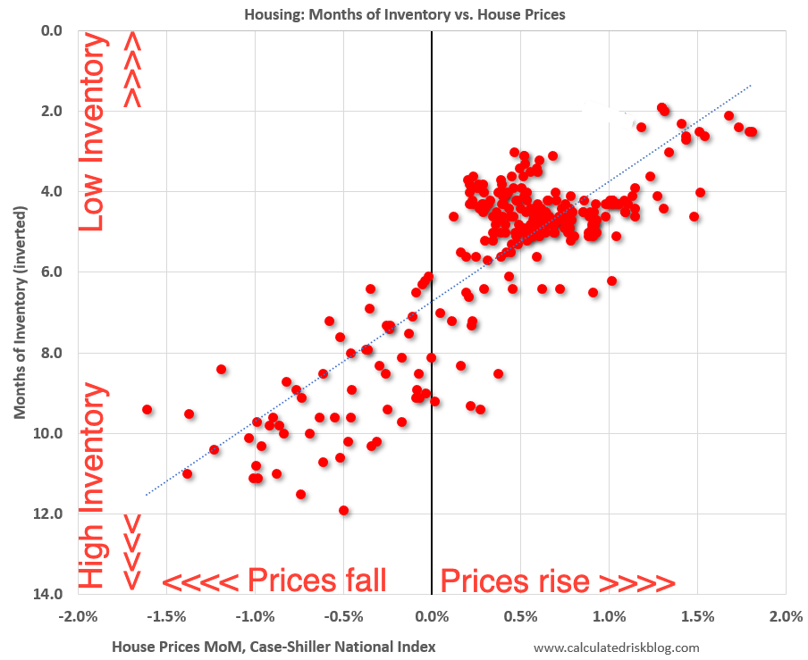
When there is low inventory in any asset (houses, cars, TVs, gasoline, Beanie Babies) and a robust demand for the asset, prices tend to rise.
If you think about it, this makes sense –– if something is in demand and its availability is scarce, then logic (ok, economics) states that prices should rise.
And using the CSI plot, that is pretty much exactly what one sees:
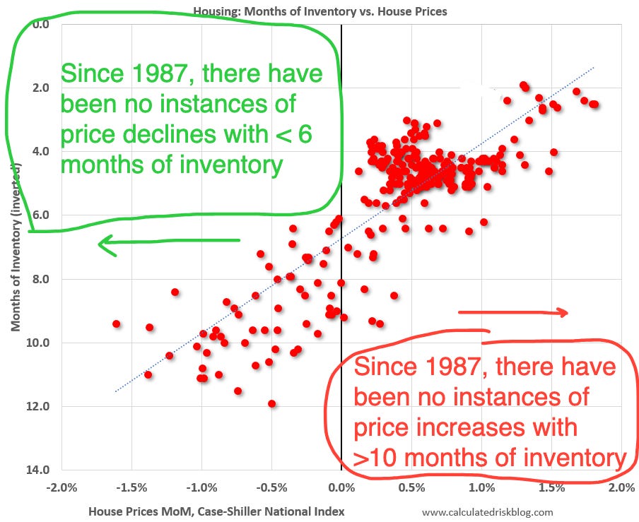
Summarizing the CSI trend line:
When inventory falls below 6 months (green), then there has never been an instance of home prices falling.
When inventory rises above 10 months (red), then there has never been an instance of home prices rising.
Between 6 and 10 months of inventory, prices can move either direction –– but the price movements are not as extreme.
So if you want to know what pricing is likely to do, keep an eye on inventory levels.
A Normal Market
Why are there so many dots congregated on the CSI between 3 and 5 months?
Because that is where inventory levels traditionally held for nearly every year prior to +/- 2006, and what most experts consider to be a ‘normal’ market (and yes, we are going on close to 20 years without it being a ‘normal’ market.)
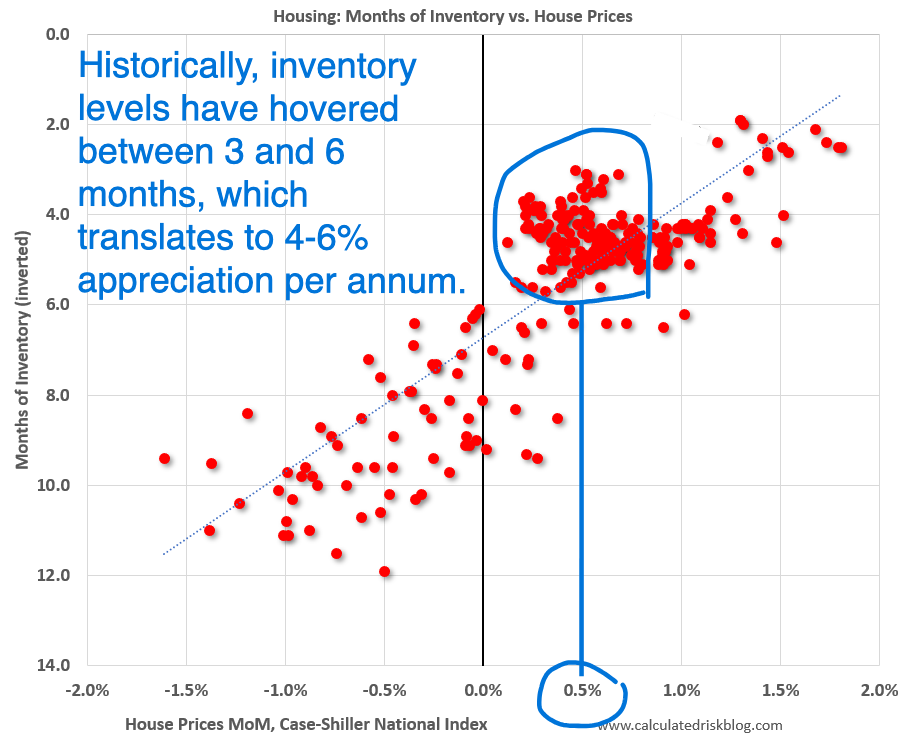
For the 30+ years before the Sub-Prime debacle of 2007/8, loan underwriting, housing starts, household formation, migration (and immigration) patterns, and work from home percentages were all more or less constant. This stability in the inputs to the housing market kept values plodding along at predictable and incremental levels –– and thus the perception that investing in your home was a safe, albeit unexciting, investment.
Seeing your home’s price rise by 3 to 5% per year every year felt reassuring –– and led to housing’s reputation as the base investment in one’s personal financial pyramid. People simply bought homes with fixed rate mortgages, went to work every day, raised their families, and diligently paid off the house some 20 to 30 years in the future.
Yes, it sometimes took 60-90 days to sell your home, but that was just how housing worked. You put the sign in the front yard and waited.
By the early 2000s, things changed.
The ‘RVA-CSI’
Ok, we got it, inventory levels predict price appreciation and different segments behave differently and it isn’t 2000 anymore –– but if you look at the CSI and then our region’s inventory, you’d think that we would be seeing even more appreciation in our market.
2 months of inventory suggests 18% yearly appreciation per the CSI –– and I don’t think Richmond’s housing prices have increased by 18% in the past year, have they?
True. They haven’t.
Why? The CSI is not a Richmond index.
The data in the CSI is drawn from the 20 largest markets in the US, and Richmond is roughly the 45th largest region –– putting it well outside the areas that are included in the analysis. So regions like New York City, San Francisco, Dallas, Miami, DC, and even Phoenix are really what are driving the CSI calculations, and those cities tend to accelerate faster when prices start to climb.
(I’d also point out that the converse is also true. Owning property in RVA when times are bad is actually a good thing as the losses incurred are far less than those who buy at the height of bubbles in other markets … so there is that.)
Adjusting the CSI to Richmond
So what am I saying?
I am saying that if the CSI was exclusively a Richmond-based index, I’d assume that the slope of the line would reduce by about half –– and there is evidence upon which to base this adjustment (see below.)
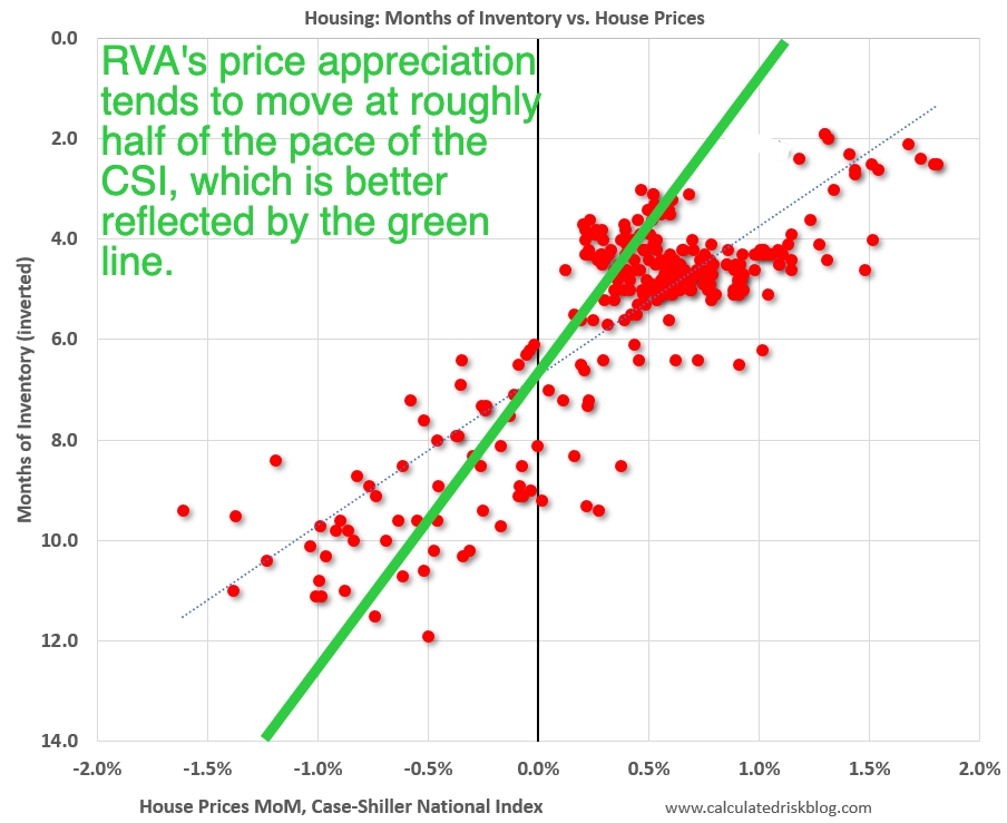
When inventory fell to 2 months or less, RVA did not see 18% price appreciation as suggested by the CSI, but roughly 8 to 10% appreciation. Historically, our market has performed well when starved of inventory, but not to the same extremes as other larger and wealthier markets.
Why Half?
Over the past 12 months, the Richmond region has seen 7.9% appreciation in its median home price during a time frame where inventory has remained at or below 2 months (and remember, we were also in an election year, which always depressed demand.)
When you cross check Richmond’s inventory with the national CSI, you see our market underperforming the dot plot by about 50%. If you want to adjust the CSI to a ‘RVA-CSI,’ I’d adjust the scale by about half to venture a guess as to what is about to happen to values in our region.
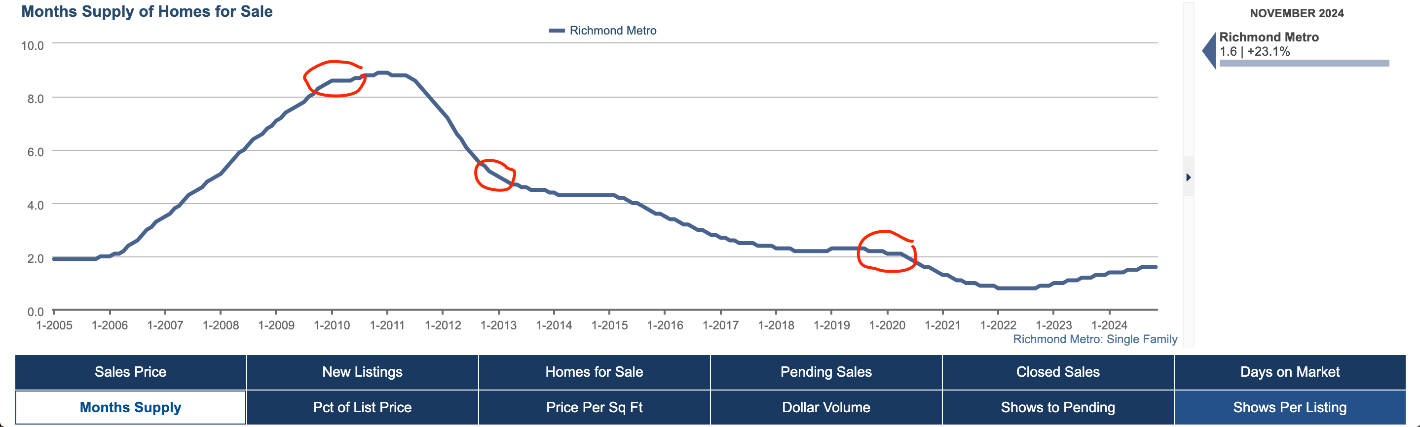
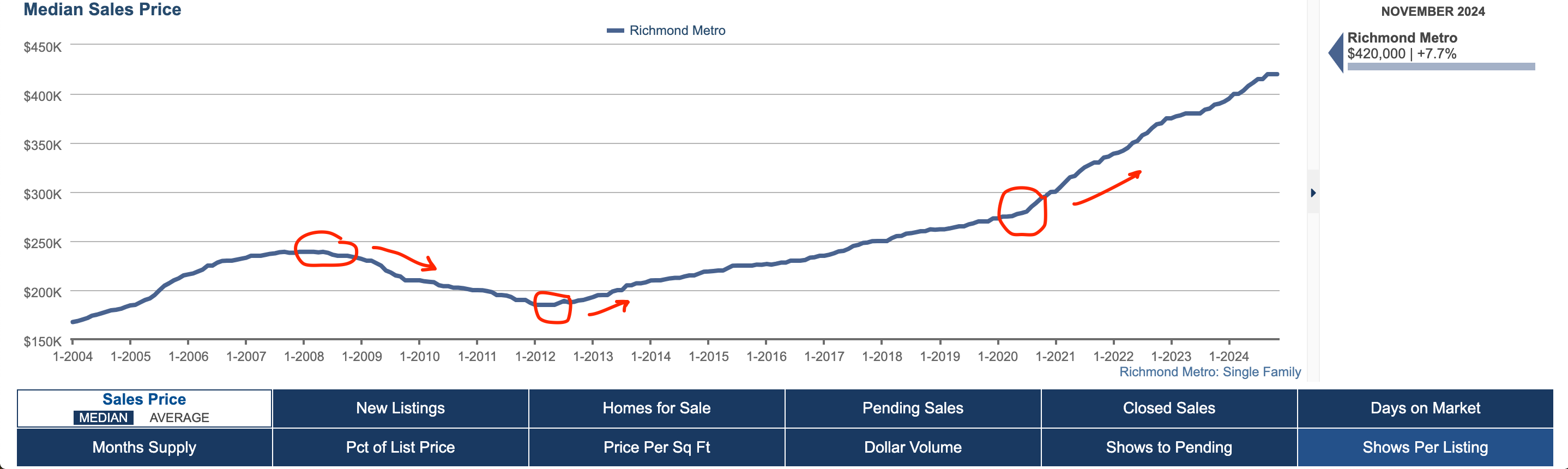
As you can see what happened with price and inventory in our region:
When inventory reached 9+ months, prices began to fall (2007)
When inventory fell back below 6 months, prices began to flatten / rise slowly (2013)
When inventory fell below 2 months, prices began to spike (2020)
These inflection points move exactly as the CSI would predict they would move, if not to the same extreme as some of the larger markets.
And thus the ‘RVA-CSI’ = National CSI x 50%.
Did I do the math? Not to the same level as Dr. Shiller.
But would I be willing to bet that by the end of 2025 I am proven right? Yes.
Where Are We Now?
If the CSI is a predictor of housing appreciation, and we adjust for being in Richmond, where is inventory now that mortgage rates are hovering around 7% and prices are up some 30 to 40% from only a few years ago?
Per MLS, our region as a whole is still quite starved of inventory –– and it holds true for nearly all market segments and all asset types.
Let’s look at some inventory measurements and check the CSI:
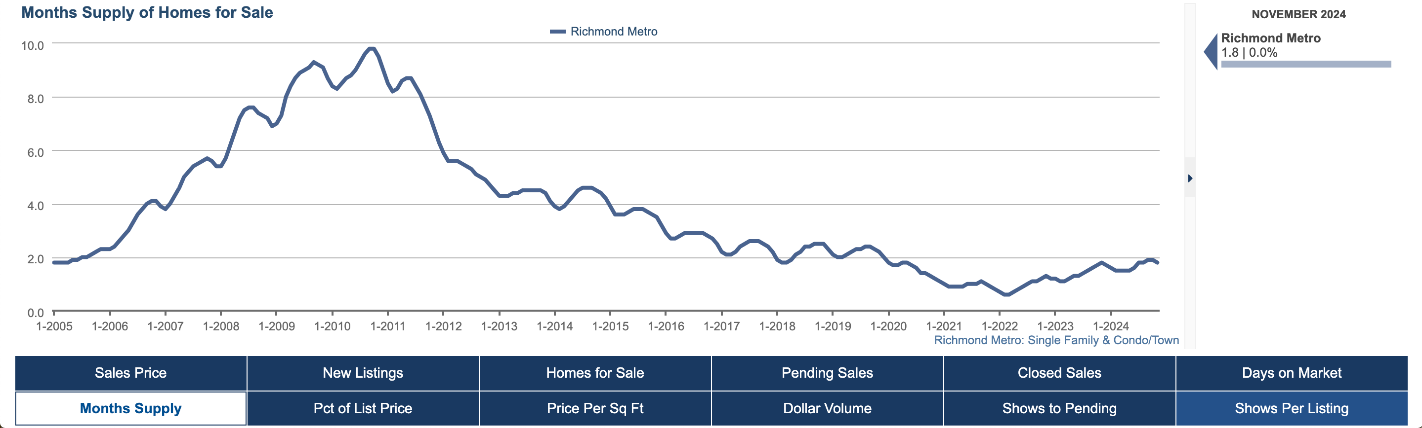
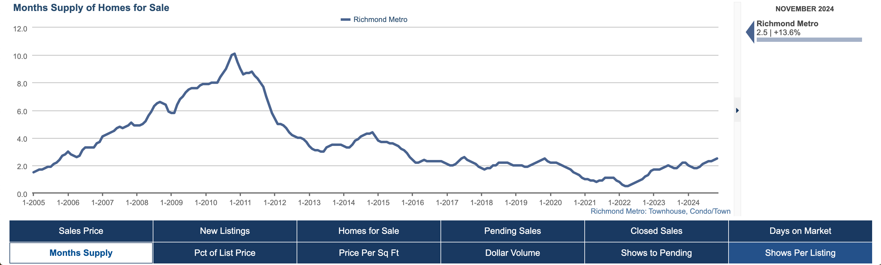
Richmond Metro
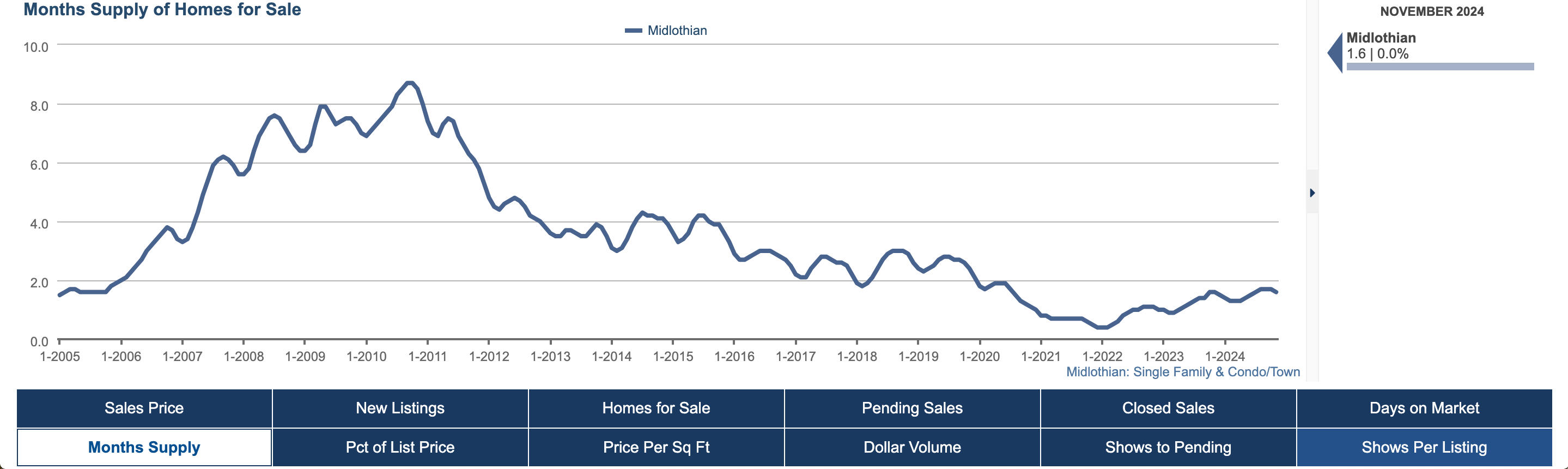
Midlothian
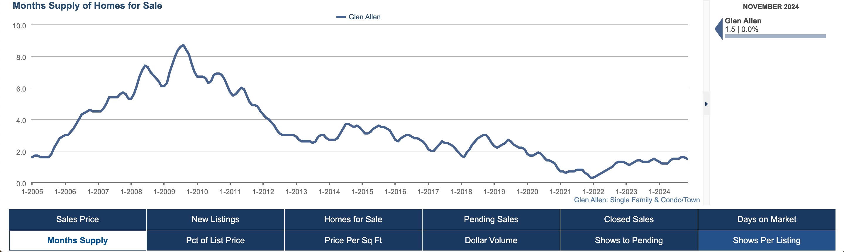
Glen Allen
Mechanicsville

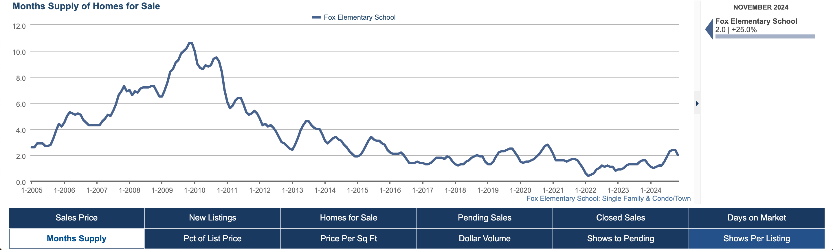
Fan District / Museum District / Byrd Park
Townhomes
City Condos
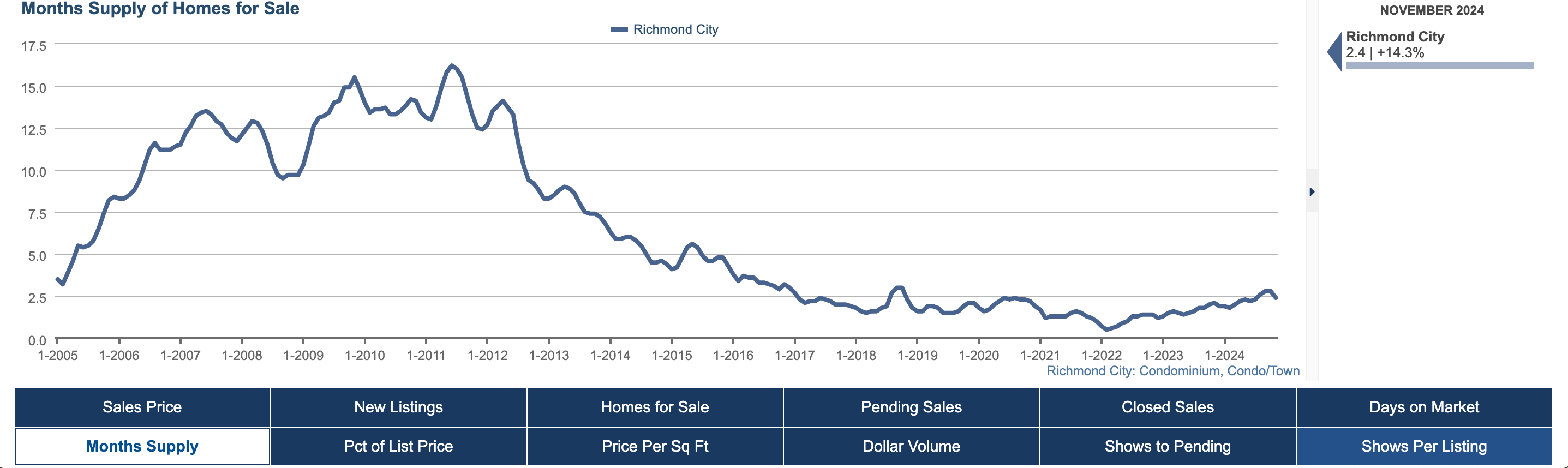
I could pull other examples, but as you can see, most sub-markets within the region are showing inventory +/- 2 months –– which is still at / below the averages heading into the Pandemic, and far from the levels of 2008 where prices were in free fall.
If we stay at 2 months, this is what to expect:
Across the board, inventory is still low enough where we should continue to see price appreciation in our market between 5 and 10%, especially in the entry and middle price points, and in the areas where new construction is scant.
Conclusion
Yes, inventory levels are up from the lows immediately following Covid and the ‘Work From Home’ migration, but nowhere near the danger zone of 2007 - 2011. So those who are predicting a crash should spend a little more time with the CSI dot plot.
Should we be worried with inventory rising? I wouldn’t, but I’ll save the reasons for another post. I think the slight increases in inventory in the back half of 2024 was more due to election interference than anything.
Even though availability and choice are up slightly from the generational lows of 2021, we are still well below normal for a combination of the following reasons:
Low levels of new construction and lot development
High inbound migration to the Mid-Atlantic
Sellers with obscenely low rates who refuse to sell (‘Locked In Effect’)
And a population bulge (Millennials) who are just now hitting prime home buying age
These are long term big / hairy macro trends that are not likely to reverse themselves in the short and / or intermediate term.
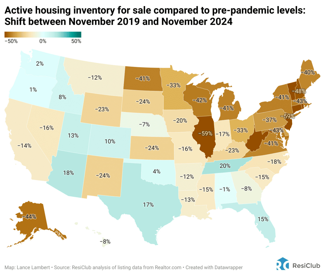
Remember, National ≠ Local
Yes, Florida is seeing inventory rise above pre-Pandemic levels, as is Texas, and even some other markets across the south are at or approaching their 2019 inventory levels –– but nearly every market in the NE (and Virginia is now firmly a NE state, make no mistake) is still quite thin largely due to the fact that adding new homes (especially affordable new homes) at scale is essentially impossible.
So as we enter 2025, inventory in our region is likely to remain quite low, especially in mature areas and at the entry level, and thus buyers should expect more of the same –– bidding wars and escalating pricing.
So if you want to know what is about to happen, use your specific segment’s inventory and check it against the adjusted ‘RVA-CSI’ to gain a sense of what to expect.
Oh, and ignore the housing crash trolls (see below.)
References
Calculated Risk Blog • Lance Lambert / ResiClub Analytics • Logan Mohtashami
Click Here for Fear

(I originally wrote this blog in the latter part of 2022, when the Fed first started to push interest rates up in a belated attempt to quash the inflation that was quickly building up in the system. Every talking head and self-proclaimed financial expert took the opportunity to offer their version of what would happen, especially those who really had no…