

We live in interesting times.
As we are getting into the throes of the spring market, all while navigating generational stock market gyrations, while watching the 10 YR bounce around like a Allen Iverson crossover, while watching Trump and China play tariff one-upmanship, and while watching the TV pundits heads explode nightly, we still have some houses to transact.

And given the fact that every time we open our laptops or phones, we get blasted with some negative take about housing, it is admittedly hard to draw an accurate bead on where we actually are.
That’s where the Daily Market Report comes in.
Background (ok, ‘The 2008 Effect’)
In 2008, I was like everyone else (well, excepting Michael Burry, Steve Eisman, and Greg Lippman) and thought that real estate values only went up.
Well, perhaps I was more of a believer that they never really went down, but only because I had never seen it happen. I thought that maybe a little adjustment happened from time to time, but I didn’t fathom that a total and complete collapse of the market was even a remote possibility.
Yeah, I was wrong. It absolutely can.
I swore to myself then and there that I would never get caught that off guard again, and began to search for ways to see the bleeding edge of the market. Given One South’s ties to the development community, I wanted to know when to get out of the way of a market collapse (and when to help my clients get out of the way as well!)
I was also very lucky that I lived at a time when gobs of data was becoming available to the average Joe for a low cost, and some powerful tools to analyze it became not only available, but affordable to an individual on a budget.
It was a good time to become an amateur data nerd — and so I did.
The Daily Market Report (DMR)
What did I do? With some help from a data scientist, I created a Daily Market Report dashboard that gets sent to me every morning at 6 am.
It compiles MLS data, extracts some preset metrics, and uses a data visualization software to create the report I share with both our team and the subscribers to my SubStack.
The Metrics I Follow
By following the 14 metrics in the report, one can get a quick sense of what is happening in our market, and see the shifts in the market over the course of the year as the seasons come and go.
Furthermore, since we have been doing a version of this for maybe 6 years, you can go back in time and see what has happened at various times in the different markets of yesteryear
Below is Thursday’s 4/10/25 report.
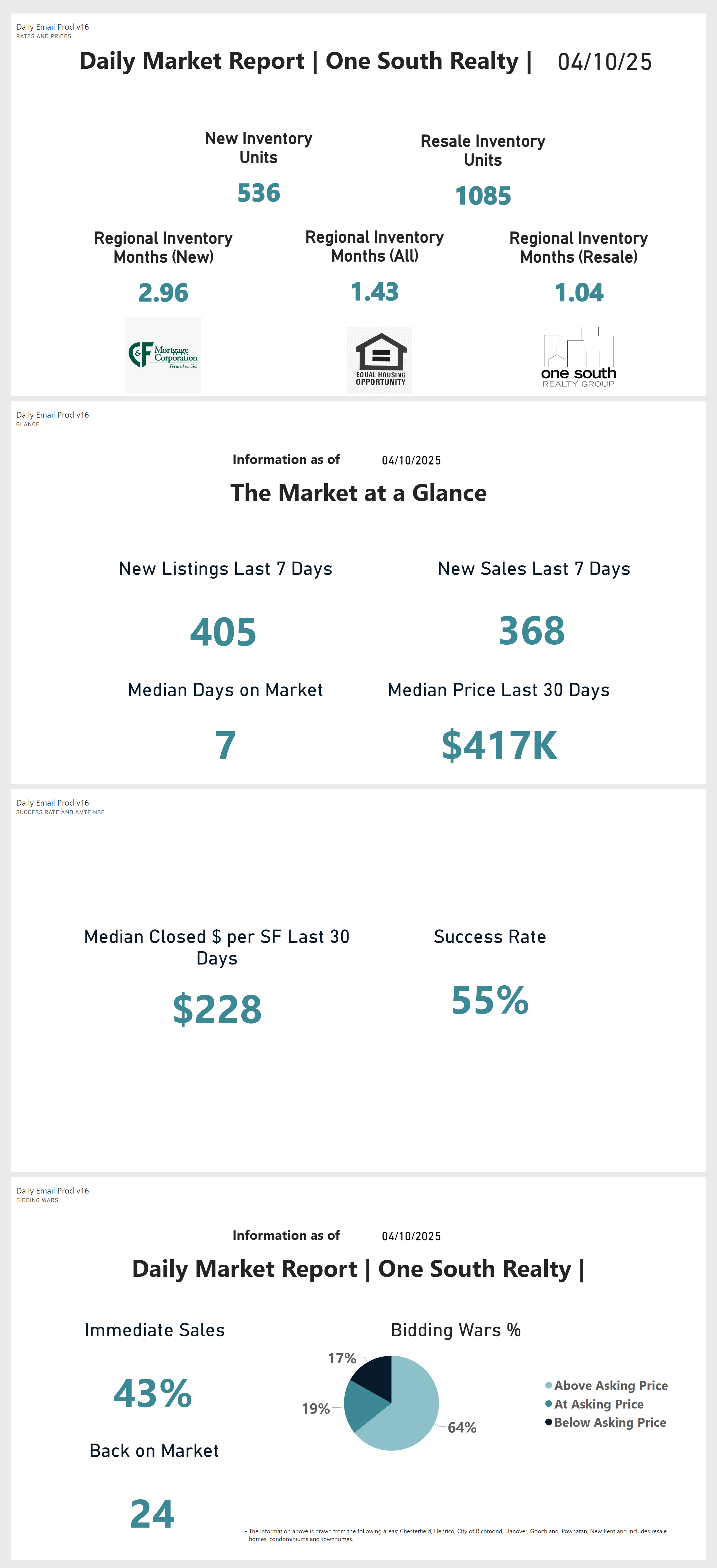
There is a lot to unpack, so let’s break it down.
The Future is ?
One thing the DMR does not do, however is predict the future.
If I had a report that could predict the future, I would not be writing a free blog from a 7 year old recliner in my living room.

Think of the DMR as more binoculars and radar than a crystal ball — so use this report (and my opinions) at your own risk.
That said, I think the metrics that the DMR tracks do a very good job of offering some good bets on what the somewhat immediate future holds. It also helps you know whether or not the doomsday Tweet your buddy just sent you applies to our market.
And if you follow the things that could upset the apple cart (changes to tax law and lending standards, mostly), you can make a far more informed decision than you can without it.
What is Being Measured?
So what does it tell us? More than you think.
The DMR tracks 14 metrics that look at changes in the market:
Day by day
One week at a time
What happened over the past 30-60 days
And since we have been tracking the market since before Covid, we can go back in time and compare the past to the present.
Time gives perspective, and offering perspective means eliminating the noise from trolls and click seekers.
Supply and Demand → Inventory → Prices
It really is all about inventory — and inventory is the primary storyteller when it comes to supply and demand.
The correlation between inventory and price appreciation is well documented, so following inventory is probably the best way to see into the future and / or predict pricing movements. We go into more detail on inventory in a moment.
Furthermore, looking at other macro inputs (such as migration and demographics) also helps to enrich the overall picture, especially on the demand side. We don’t combine these in the DMR, but we do talk about them often in our blogs.
When all said and done, by following prices when the metrics are where they are, and understanding the rhythm of seasonality, you can really get a sense of where the market is now, and where it is likely headed.
Part I | Inventory, Pricing, and Time
There are two basic THINGS getting measured in the DMR:
Inventory.
Pricing.
And there are three basic TIMES being measured in the DMR:
Today.
Last 7 days.
Last 30 to 60 days.
And because we have been doing this for a while, we can go back to before Covid when we need to and see what was happening — which gives us a lot of ways to frame the data.
Inventory
Let’s dive into ‘Inventory’ and ‘Units for Sale.’
If you notice, I break the inventory out into ‘new’ and ‘resale.’
Why? Because our MLS does not track new inventory as accurately as it does resale inventory.
MLS and New Homes
When you walk into the sales office in the new subdivision, not every lot or building opportunity is listed in MLS.
Furthermore, when it can take 9-12 months to build a home, should a house at foundation stage be counted as standing inventory? Sorta? Kinda? Not really?
And so we count new homes separately given the inconsistency in the data.
New Home DOM?
Another issue is that the new inventory does not track the days on market and thus skews the DOM stats. Days on Market is a HUGE metric to track (more on DOM in the next section) and having it skewed by new homes severely compromises its value.
Besides, new homes only account for maybe 20% of the overall market in any given year — while that percentage has been in creasing as resales have become more scarce. But even by looking at new homes separately, we are still able to paint a really accurate picture of market conditions.
Unit Count + Inventory
So when you look at the top section of the DMR, you see both an actual count of new homes that are available and resale homes available (which includes townhomes, condos, and single family.)
If you notice, we count the ‘inventory’ statistic in three ways as well:
Resale inventory.
New inventory.
Combined (all.)
Another note — unit count is not inventory. Counting available units is just looking at the total numbers of homes available, but ‘inventory’ looks at the ratio of available homes to absorbed homes.
‘Months of inventory’ asks the question, ‘At the current rate of absorption, how long before we would run out of listings if no new homes came on the market?’
Months of Inventory = Active Listings / Pending Listings in the Last 30 Days
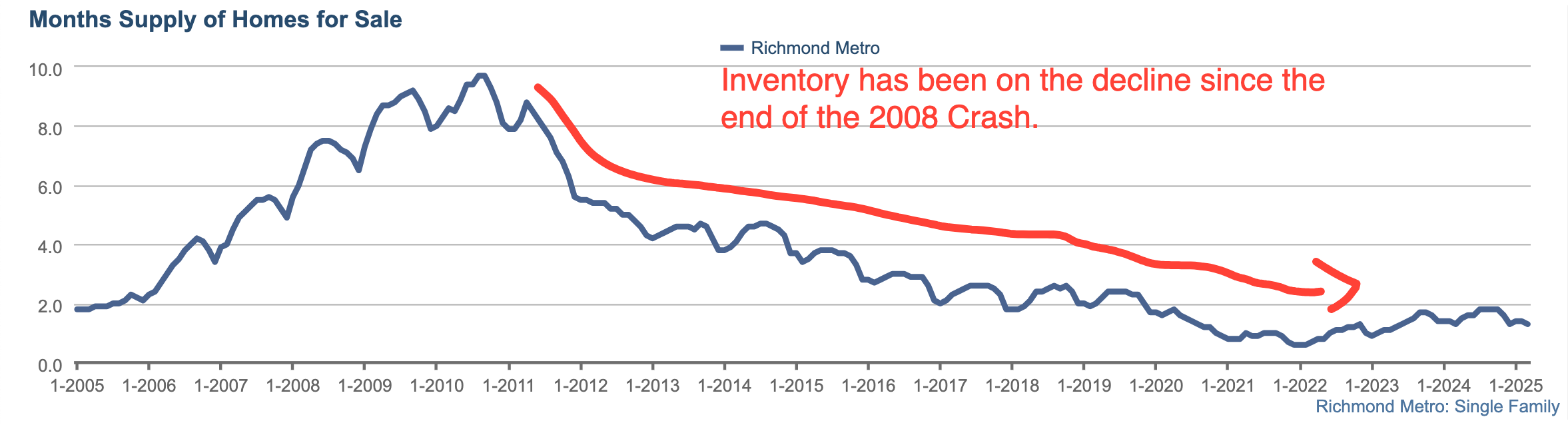
The Case-Shiller Index (discussed in great detail here) essentially states that there is a very strong correlation between inventory and home price appreciation:
When inventory < 6 months, history shows that prices rise
When inventory is > 10 months, history shows prices fall
When inventory is between 6 and 10 months, history shows prices can go either direction, but they don’t move very much in either direction
And his is key — when inventory is at extreme points (3 months or less, or 12 months or more) you get extreme price movements.
Oh, a quick reminder, Richmond has 1 month of resale inventory and +/- 1.5 months overall.
Part II | At a Glance
The ‘Glance’ section is the original gangster of the update. I think we created it in 2018 (or thereabouts.)
The ‘Glance’ section looks at what is happening at the tip of the spear and looks at how inventory is moving in and out of MLS over the course of the week, and what the properties that went under contract 30-60 days ago finally settled for.
Note — When a home goes under contract, the contract price is not disclosed until after the property settles. So knowing a home listed for $400K went under contract is helpful, but whether it sold for $390K, 400K, or even $420K is not known until it closes. And thus, pricing has a 30-60 day lag.
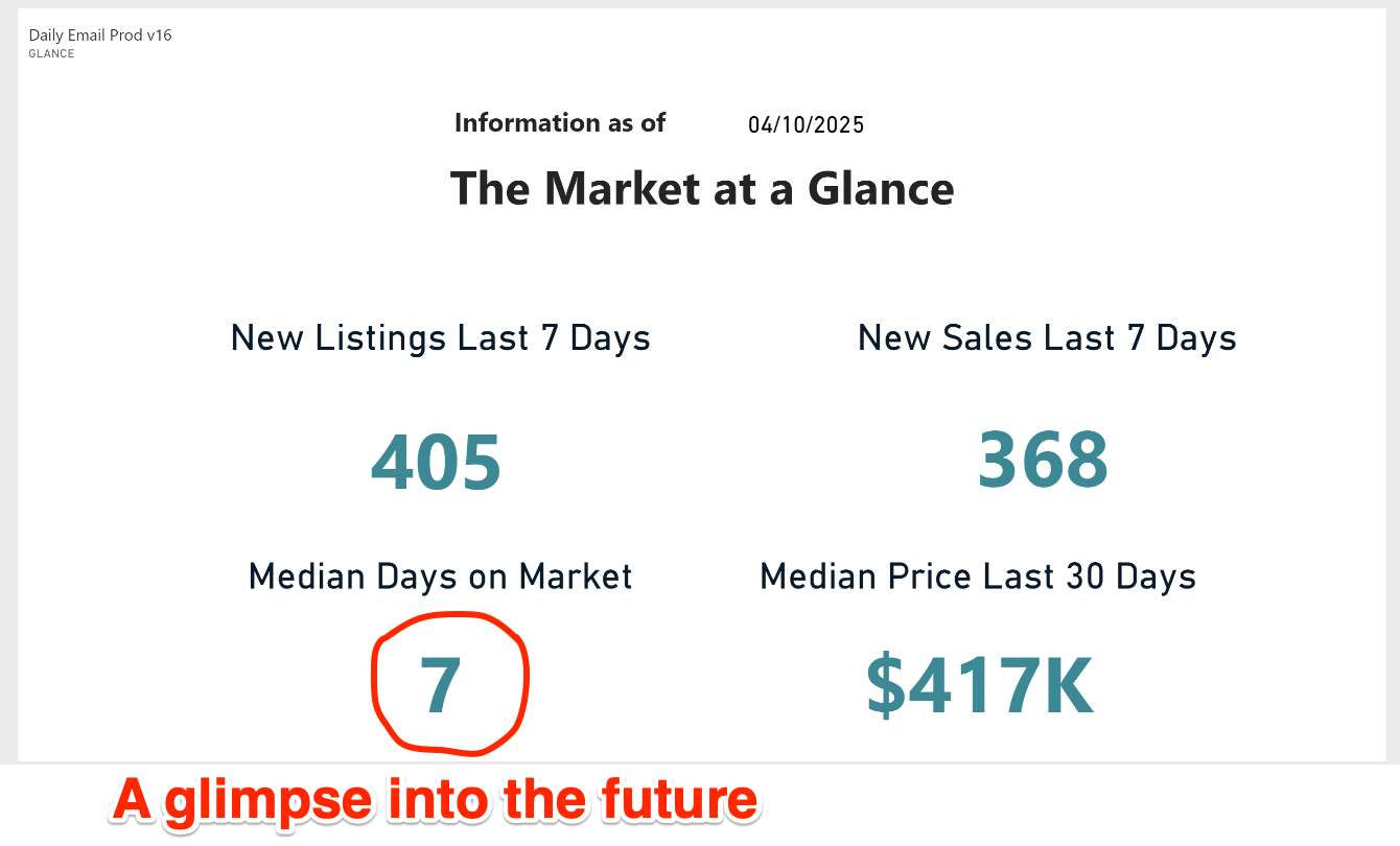
Why is Days on Market ‘A Glimpse into the Future’
Days on Market (DOM) matters, and it matters a lot. DOM is the most telling stat of how hot a market is, and what pricing is likely to be doing.
To understand DOM, you need to know how it is counted.
Today, properties are generally marketed as follows:
Properties are typically placed into MLS earlier (Tuesday or Wednesday) in the week, with the first showings not allowed until later in the week / weekend. This is done to pent up the demand a bit and create a sense of urgency.
Typically, showings start Thursday / Friday, with an open house scheduled for Sunday — again, to create pressure on prospective purchasers.
Offers are generally reviewed the following Monday, with the final details of the winning offer negotiated over the next day or so.
And finally, sometime the next week, the status in MLS changes from ACTIVE to PENDING, and the DOM is recorded at that time.
This is a long-winded way of saying that any DOM under 10 days is really a first weekend sale.
A first weekend sale also often means that more than one offer was received, and when there is a bidding war for a home, prices generally escalate above the asking price.
Therefore, if DOM < 10, the prices are likely to be above the asking price when they settle, driving prices higher — and thus the reason that DOM is the best glimpse into the future of prices.
Another quick note, while the tariff on/off saga was going on, especially over the last week, the DOM stat moved from 8 days to 7 days — so if anyone wants to argue that tariffs are affecting demand, the DOM numbers would suggest the opposite.
Just sayin’.
Part III | Median Price / Median Price PER FOOT / Success Rate
The next section(s) of the DMR deals with prices, mostly.
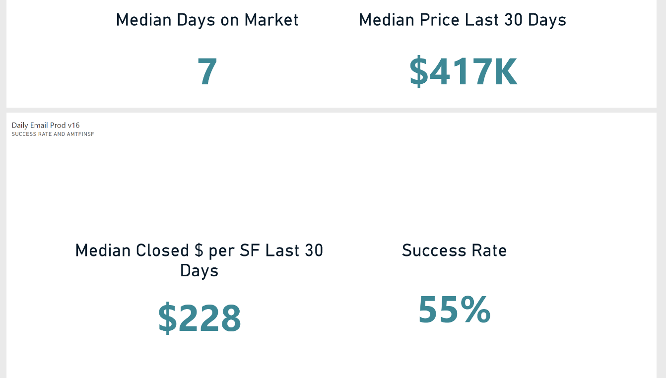
The section is pretty self-explanatory on the surface, but contains some very important subtleties.
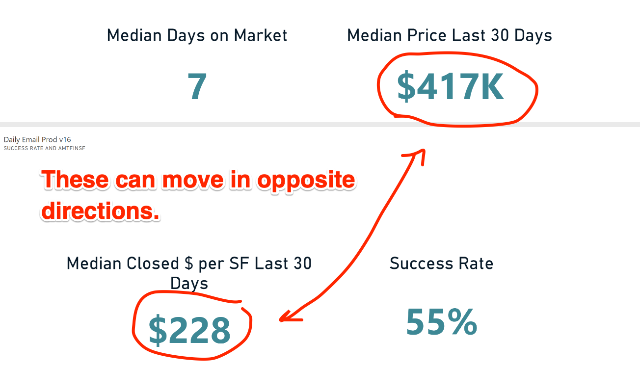
Median Price vs Median Price PER FOOT
Why do we track both? Because they measure different things.
Median PRICE
The median price of a home is what it is — it is measuring the middle of the closed prices of all homes that sold. Median Price provides insight about the overall pricing of housing in a region and whether it seems to be increasing or declining.
But that can be misleading, because median price is not measuring the value of housing as much is measuring the most popular price of housing.
Make sense?
Median price is reflective of the median income in a region — as what people earn drives what they can afford.
It’s almost better the think of median price as a popularity contest, not some sort of measurement about prices moving up or down.
Median Price PER FOOT
But Price PER FOOT tells a different story.
Mortgage rates heavily influence median price, but median price PER FOOT is more influenced by actual demand.
When the median house price rises or falls in a region, it is a function of incomes and mortgage rates. How much you make and what the borrowing rate is drives how big of a price of a home you can afford.
But if incomes are stable and mortgage rates are high(er), then people will buy smaller homes — which means that the price of the home didn’t move much, but the size they were able to afford dropped considerably.
Stated differently, what $400K bought in 2020 and what $400K buys today is probably 30-40% smaller — and that is reflected in the Price PER FOOT.
Think ‘Shrinkflation.’
As mortgage rates have gone up — sharply — since the Fed began its attempts to quash inflation, the typical buyer has moved down in terms of what they can afford. When buyers all move down the price gradient, it creates increased competition for the less expensive housing.
When less expensive housing is in demand, it can impact the Median Price negatively but the Median Price PER FOOT positively.
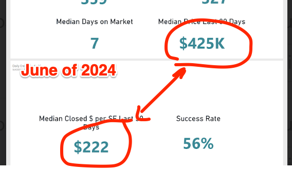
If you look at Thursday’s report vs the report from last June:
Thursday — $417K Median Price and $228/SF
Last June’s report — $425K Median Price and $222/SF
You see exactly what I was referring to — the median price today is lower but the per foot is higher.
$/SF Better Describes the Market IMO
Does that mean the market is down because the median price is down? That is what the talking heads would have you believe, and I think that they are wrong.
So paying attention to the price PER FOOT in many ways is more informative to the real value of housing in that it minimizes the impact of mortgage rates and housing size. By eliminating size, the cost of 1 square foot of housing emerges.
By setting 1 SF of housing as the constant, and when measured over time, $/SF more reflective of the actual value of housing.
A subtle, but important, difference.
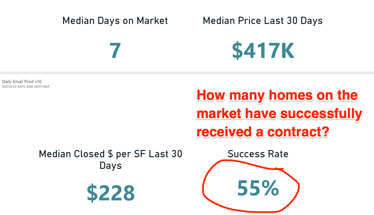
Success Rate
Last summer, we added ‘Success Rate’ to the metrics we track.
Success Rate probably belongs in the first section of the DMR as it is more related to inventory than anything, but we are better at creating stats than we are at presenting them properly.
(Sorry. I’ll talk to the design team.)
Success Rate measures the ratio of homes that are on the market and homes that are under contract:
Success Rate = Pending / (Active + Pending)
SR is measuring how ‘successful’ sellers are at getting a contract.
Reminder:
Under 40% is a buyer’s market (buyers have a lot of choices.)
+/- 50% is a balanced market.
Over 60% is a seller’s market (buyers have a lot fewer choices.)
In Spring of 2024, we touched 60%. In the Winter ‘24, we fell as far as 48% — so seasonality has a lot to do with it.
55% is a seller’s market, and given the 1.5 months of inventory and DOM of 7, I would expect to see the Success Rate continue to rise as we get deeper into spring / summer window.
Part IV | Bidding Wars / Immediate Sales / Back on Market
The last section is a bit of ‘catch all’ in terms of the metrics we track, but you can still find some valuable intel here.
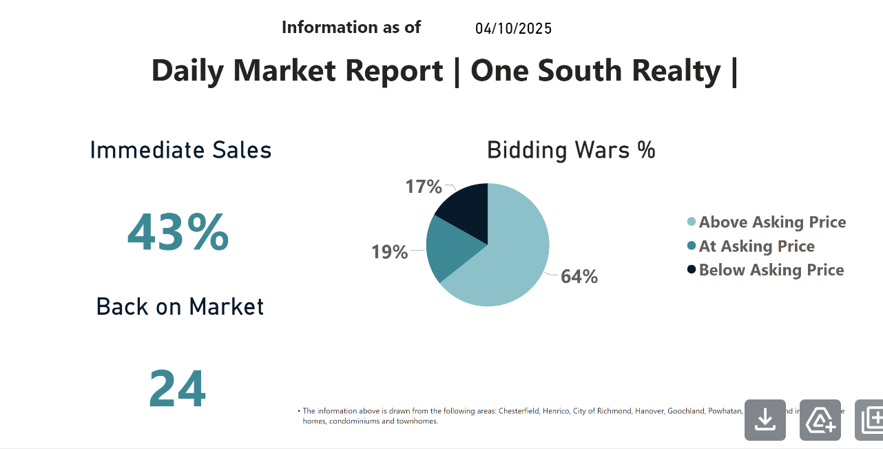
Immediate Sales
The Immediate Sales stat looks at how many of the most recent sales went under contract in less than 10 days.
As we talked about in the DOM section, Immediate Sales shows what percentage of homes are selling more or less in the first weekend. What it is really measuring is how quickly buyers are acting — and so if you are a buyer, if you see 40-50% of all homes selling in the first weekend, you need to be aggressive and prepared.
The days of seeing a listing come out, waiting until the weekend to go tour it, and then calling your mortgage broker the following week to talk options are over.
Buying a good home today means acting immediately.
Back on Market
When a house goes under contract, both sides are expecting it to close.
But that doesn’t always happen.
For any number of reasons, contracts fall apart and houses come back onto the market:
When the market is hot, then the typical protections that buyers seek to have written into their purchase contracts (appraisal contingency, financing contingency, inspection contingency) get negotiated out, and thus, more contracts stay in place.
As inventory rises, or if economic conditions suddenly deteriorate and loans fall through, you tend to see a higher number of deals blow up and the back on market count rises.
We added this metric at the beginning of COVID, expecting to see deals blowing up more often and thought it would be a sort of ‘canary in the coal mine’ as to how much the market was changing.
What we saw, ironically, was the opposite.
Bidding Wars
The final metric on the DMR is the Bidding War Percentage.
What this is measuring is of the homes that recently closed, how many:
Sold over the asking price?
Sold at the asking price?
Sold below the asking price?
Of the homes recently sold in 2025, roughly 2 in 3 are closing above the asking price. This should not be a surprise given the DOM of 7, a success rate approaching 60%, and 1.5 months of inventory.
Everything is Related
At the end of the day, it is all related.
DOM is related to Inventory is related to Success Rate is related to Bidding Wars is related to Median Price. If you see inventory rising, then you will probably also see it filter down through the other numbers.
Right now, despite all of the turmoil and upset coming from financial markets and the whiplash nature of governmental trade policy, RVA’s housing market is not seeing anything other than what we have been seeing — buyers outnumber sellers leading to prices pushing upwards.
Sorry if that runs contra to the narrative that the internet would have you believe.
The Whole vs. The Sum of the Parts
A final note.
RVA’s market in the aggregate is composed of dozens (if not more) sub-markets, all with their own set of inputs:
Areas south and west of the city (Midlothian / Moseley / Chesterfield) are where homebuilding is most prevalent, and thus inventory is a little higher.
Closer in / mature areas (Fan / Westham / Church Hill) are harder to find places to build, and thus inventory tends to stay lower, meaning bidding war percentage and success rates are likely higher.
Furthermore, with the median price of a new home in the upper $500s to 600s, inventory at prices below the cost of a new home is likely lower and competition is stiffer.
So I would not assume that buying a new home in Powhatan on acreage versus a fully renovated Windsor Farms colonial will be the same experience.
Again, the DMR is not submarket specific, but these numbers can be teased out if you want to, it just takes a few cups of coffee and a quiet morning.
But I digress.
The real value to me is being able to take 2 minutes to get a sense of the market. So when you see headlines talking about the inventory surge in Florida and Texas, and the subsequent prediction that ‘2008 Redux’ is on the way, you can simply look at the DMR and make an informed decision as to whether or not the RVA market is behaving similarly.
As of right now, I don’t see it.
Knowledge is power.